


DutchBorderer
-
Posts
1,496 -
Joined
-
Last visited
-
Days Won
1
Content Type
Profiles
Forums
Events
Store
Posts posted by DutchBorderer
-
-
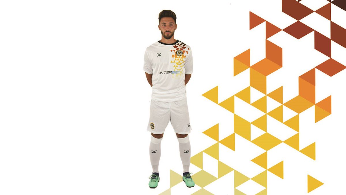
Newport County continue with FBT, who also supply Livingston in Scotland, and Crewe and Doncaster in England. Their new home and away shirts are modelled on the tops worn from 1938 through the second world war. Very nice, although the bands across the tummy end rather abruptly. The third kit is a more modern affair, reminiscent of Spain's away kit of yesteryear (click to enlarge, you know the drill);

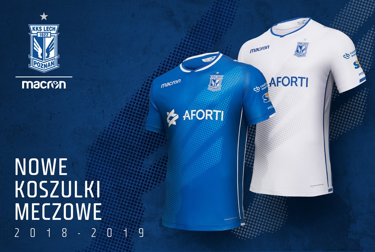
Lech Poznán is one of the top teams in Poland and have been bestowed a rather simplistic design by Macron, which is elevated by a beautiful graphic of one of the crest's wings. Very tasteful. Note that the away kit seems to be a complete colour swap save for the top of the collar;
 0
0 -
Make that 2-0, McMillian.
0 -
28 minutes ago, Bully Wee Villa said:
I get that we are going back to the eighties for inspiration, but I'm still struggling to see the logic behind ignoring the almost universally-popular League Title or European Cup Final kits in favour of the one that saw us finish tenth and commence our descent from Champions of Europe to relegation.
Especially when the former two both had blue sleeves

It's Luke (the designer guy)'s favourite shirt so there you go. No doubt a return to proper sleeves is on the cards for 19/20.
0 -
45 minutes ago, Salvo Montalbano said:6 hours ago, Bully Wee Villa said:Villa....
The away kit looks nice. Hate the home kit, though. If it hasn't got blue sleeves, it's not a proper Villa shirt, IMO.
Villa home top looks identical to the new West Ham home top - even down to the blue bit on the sleeve rather than the full sleeve. Are they made by the same firm? Not sure which scenario is worst tbh.
West Ham is Umbro pushing planned obsolescence, Aston Villa is a local casualwear company called LUKE1977 which took inspiration from one of Villa's strips from the 80's. I don't like either of these new strips.
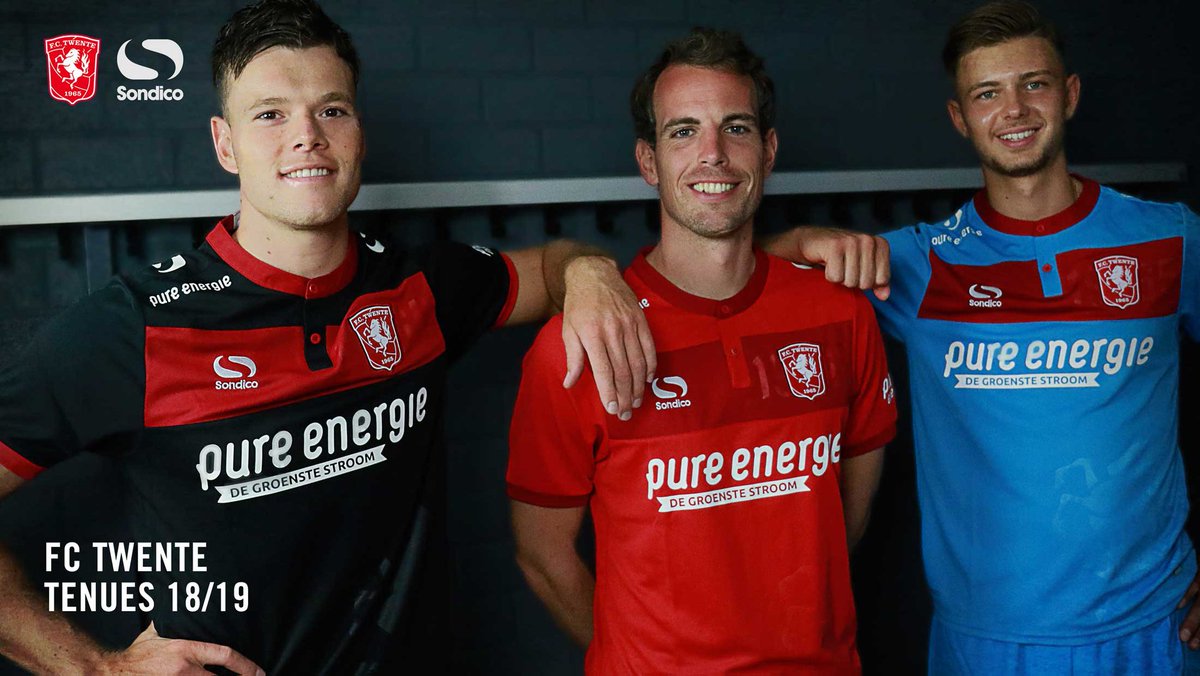
FC Twente remains the only club on the continent to wear Sondico, and for good reason because these are a bit pish; an awkward chestband which is visually ruined by the collar clipping into it. Year of founding is placed behind the badge (which Macron keeps doing this year), and the stallion of Twente is a watermark o0n the body panel.
 0
0 -
26 minutes ago, AyrTroopMajor said:
Sunderland. Love them both, but apparently the home kit has been ruined by having an all red back because Adidas think that looks good...
Want to hear a load of corporate shitebaggery?;
Spoiler
For some reason, adidas has decided that all their striped partner clubs in the UK (and elsewhere, I imagine) will have plain backs this season. The payout for this would be 'more tailoed and bespoke detailing', but that's poppycock of course. I surmise striped back panels to be a bit more expensive to produce, and thus, adidas decided against having them so they can skim off an extra cent or two off every kit produced. Standout designs my arse.
Take note that Sunderland's away shirt is the Condivo desing, which was also used for the away shirts for Scotland, Wolves, Feyenoord, Ipswich, Leicester, Watford, Anderlecht, Copenhagen, Sweden, Aberdeen, Valencia, Wales, Olympiakos, Universidad de Chile, Cardiff, Benfica, Celta de Vigo, Besiktas, Belgium, Algeria, Northern Ireland, Iran, and loads of others I'm sure.
I'm serious, look it up if you're autistic enough for it; they all have the exact same design in different colours.
0 -
I love a good kit-related cock-up, can this be canonized?
0 -
How pish was Berwick today?
0 -
2 minutes ago, Emfaefifeyahoorsur said:
Hi Dutchborderer, by any chance are you from Gala’ ?
Nay lad, I am Dutch (trust me, I am disappointed too)
0 -
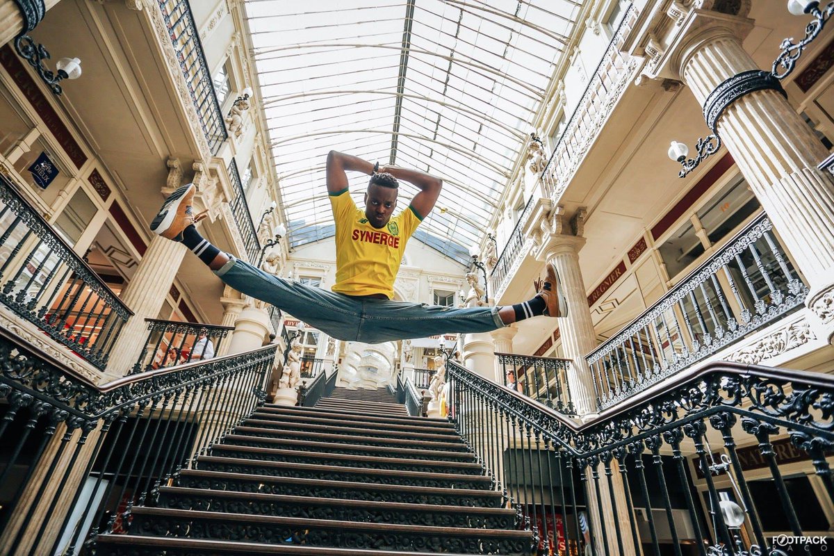
FC Nantes launches their new home kit with the tagline 'Le suck it';
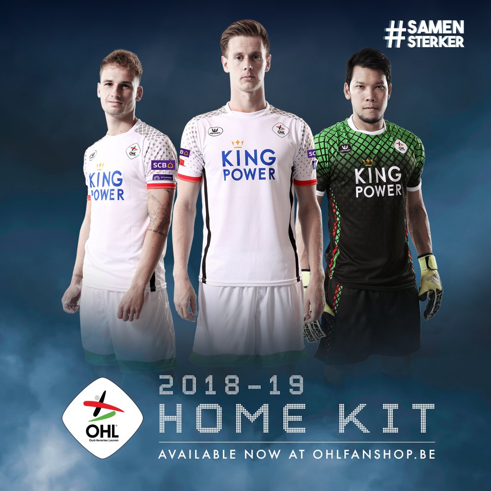
Oud-Heverlee Leuven of the Belgian second tier are known for their budget crest, and don Belgian brand Vermarc with Leicester City's sponsor;
Millwall return to Macron after two seasons with Erreà, and claim to model their new home shirt on the old Captain Morgan shirt. Unfortunately, they look nothing alike;

By far the most tinpot kit launch to happen so far comes courtesy of Dutch NEC Nijmegen, who revealed their new away top and signed a new player in a random fan's backyard;
 1
1 -
In typical Hamburgerland tradition, the MLS think it's smart by having a league-wide sponsorship deal with adidas, which means all clubs will be kitted out by the German purveyors of spaghetti on your shoulders or under your elbows.
Unfortunately, despite many millions of Dollars being involved, adidas doesn't really seem to give a shit judging by what the goalies wear;
 0
0 -
25 minutes ago, highlandcowden said:
i think we have a winner for worst looking sponsor of the new season,totally intrusive
A CHALLENGER APPEARS
(although it's more due to the black hole around it)

Away kit is decent. I will laugh if the yellow splotch on St Johnstone's kit ends up being like Maidenhead's home shirt;
 0
0 -
Andrew Driver? Oh my, he'd be a right asset for you guys, did really well with de Graafschap the past couple of seasons culminating in promotion via play-offs in May. Sad to see him leave the Netherlands as he would be a fine player for them in our top tier, but the best of luck to him all the same. Hoping he signs with yous or some other Prem team.
0 -
43 minutes ago, German Jag said:
Hannover 96.
Not a fan of the lurid green on the badge of the away strip, but otherwise nothing too hideous.
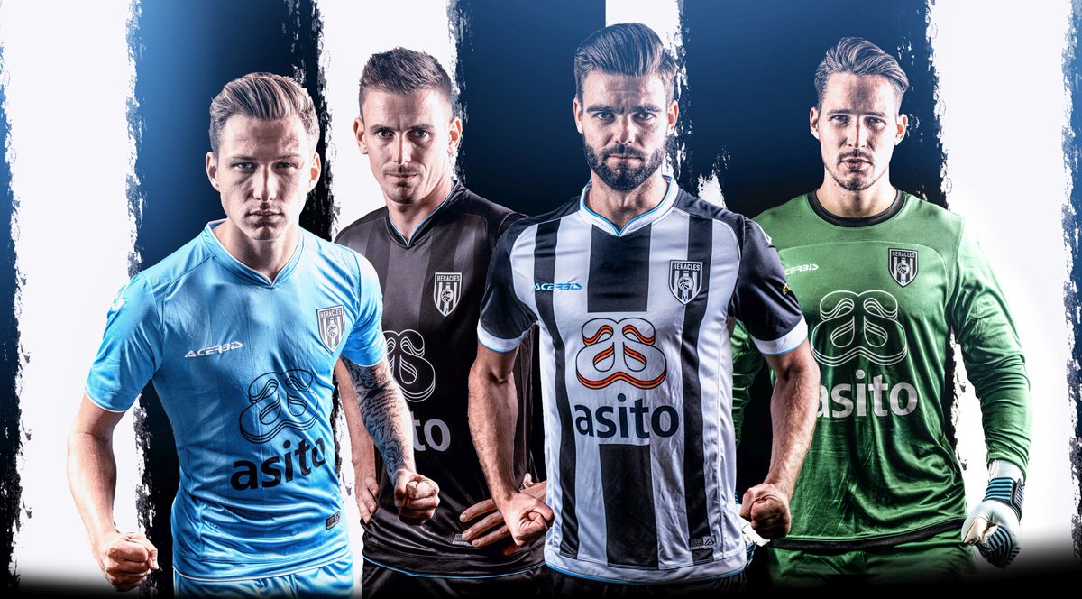
Heracles Almelo, the Netherlands;
 0
0 -
Ooooh Norwich, that is downright naughty. The sponsor can get tae f**k, but everything else about this shirt is pure sex. Inspired by 'that' shirt from the 90's (you know which one I'm talking about);
 0
0 -
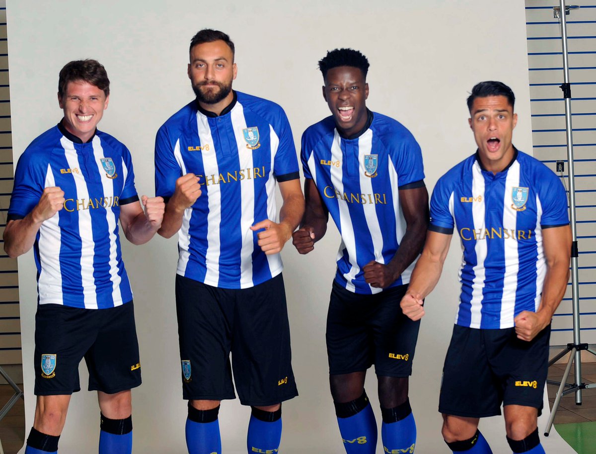
For the second year running Sheffield Wednesday is supplied by..... their in-house energy drink. Seriously, Elev8 is registered as such, but apparently no one has ever seen a can, so I don't even know. A welcome return to stripes after last season's pinstripes, but I really wish they went back to the previous crest;
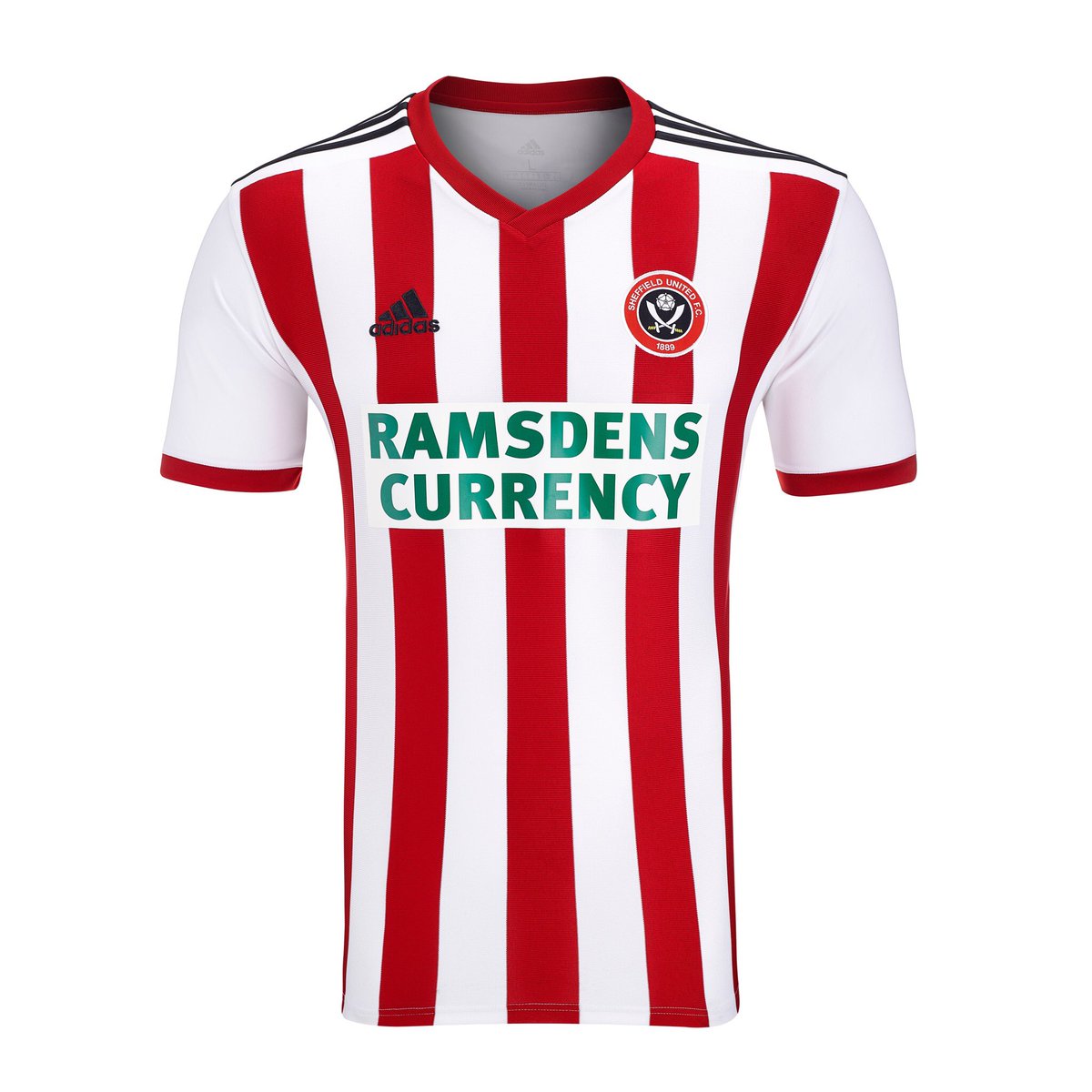
As for their eternal rivals, Sheffield United.... well the Blades had the better shirt last season, but this new one is a miss; Ramsdens insisted on using their corporate green, and someone forgot to put the stripes on the back. Sheffield United from the front, Leeds United from the back;

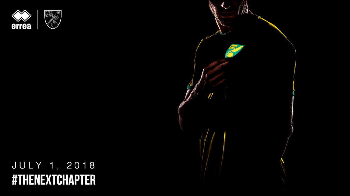
Finally, and this is what I am always looking forward to, a glimpse at Norwich City's new Erreà kit, which will be launched tomorrow;
 0
0 -
I disliked the Jupiler League name, considering the sponsors were a particularly bad purveyor of Belgium beer, but the second tier of Dutch football now has a new name and sponsor.
*drumroll*
Keuken Kampioen Divisie! Or in English, Kitchen Champions League! Woooooo! Tinpot.
 1
1 -
2 hours ago, Silverton End said:
^^^^^^^^Very similar to Huddersfield Town's change strip
Now we're on the topic anyway, having stripes or a plain back feels rather arbitrary; Bournemouth get their red and black, but Huddersfield and now PSV are stuck with plain black and red respectively. The PSV shirt on the whole is a bit shite, mostly thanks to a cheapo energy company loathed for its cringy adverts, the plain back, and the 'quirky' logo on the back. Random bits of white on the shoulders don't help either.

 0
0 -
10 minutes ago, Landan Spiv said:
Was gutted I had to leave early but had to get that 21.33 train back. Unfortunately my pal who also has the twitter login had to leave as well so there was no one to carry on the updates for the last ten minutes. I'll be doing a live feed from the game against Whitehill Welfare tomorrow. Ill stay until the end this time haha
So is it just you two or are there more people at the helm? Always a bit of a guess who is doing the tweeting, but good work all the same.
0 -
7 minutes ago, IainMorton said:
Is that a normal sight in Perth, people with two heads?!
No shame in marketing your products to the genetically unique when your market is Perth of all places.
All jokes aside, they are wearing the single largest size of strip available in Scotland (and the UK as a whole); 7XL, or XXXXXXXL if you must, unique to St Johnstone. You could pitch a tent with it (lord knows those two lassies had that effect on me already
 ).
).
Bournemouth have released their new home shirt, which does actually work with the M88 bet logo, but it's just way too big. Stripes on the back are pleasing when a few other Umbro clubs have stuck to plain backsides;

 1
1 -
In case anyone's already a fan of Kieran Stewart, Berwick is selling his matchworn shirt on the club shop. Might be worth a punt if you like these kinds of memorabilia;
http://store.berwickrangers.com/products/match-worn-kit
Fair play to the SC fella livetweeting the game yesterday, shame he left early.
0 -
13 hours ago, Steve McQueen said:
Atalanta's kits for next season.
Which one is your favourite?

I unironically prefer the Saint Johnstone ones..... what's wrong with me?
 0
0 -
I never understood why the A-League didn't expand further, even despite the scare of both Fury and Gold Coast United flopping hard. Since then we've gotten one Sydney and one Melbourne club, with the latter being a gangrenous corpse tied to the City Football Group's strings. Crossing my fingers for Tasmania to finally get their team, really hope they'll be selected but it'll probably be Wollongong and a second team from Melbourne or Adelaide.
Was ready to back Fremantle City but with Juventus behind it á la Melbourne City, I'd rather not.
0 -
I personally dislike red and yellow featuring on the same shirts, the two just don't fit together. Nonetheless, RC Lens managed something nice by largely separating both with black detailing. Sponsor Auchan is a French Hypermarket chain who have relinquished their corporate colours in their chest outing (click to enlarge);

A bit of Scotland in the Netherlands then; Go Ahead Eagles are going into their 30th (!) year of contract with hummel (their Dutch HQ is in Deventer, hence the longlasting connection), and for the anniversary season 18/19, they let fans vote for their favourite designs from those three decades to be remade but with updated crest and sponsors. The results are to die for really, and they come with a pretty nifty reveal video to boot;
The three chosen kits and the options fans got to vote on (click to enlarge);

 0
0 -
I think the home shirt is horrendous and very not-Vitesse (almost a halved shirt rather than stripes), but the launch is pretty nifty; both shirts are an ode to Hertog, the club's mascot who flies circles in the stadium before each match
(Click on the shirts to enlarge)

 0
0


 ).
).


New kits; 2024/25 Edition (new season kits trickling in)
in Misc Other Fitba Chat
Posted
The whole 'digging out your old kicks' theme seems to be running rampant the past few days, if not the entire off-season already. Fulham combines two fan-favourites from the 90's whilst Scunthorpe will don a recreation of the last shirt they won a final at Wembley in (enlarge to click);